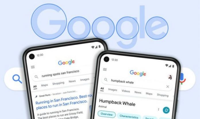
Speaking about the upgrade, Cheng said: “We wanted to take a step back to simplify a bit so people could find what they’re looking for faster and more easily,” she says. “I find it really refreshing. To me, it’s a breath of fresh air!
“We started with organizing web pages, but now there’s so much diversity in the types of content and information we have to help make sense of.”
Finally, if you’re noticing the new design feels a little bubblier and bouncier, Google says “you’re onto something”.
“If you look at the Google logo, you’ll notice there’s a lot of roundness to it, so we’re borrowing from that and bringing it to other places as well,” added Cheng Aileen.


